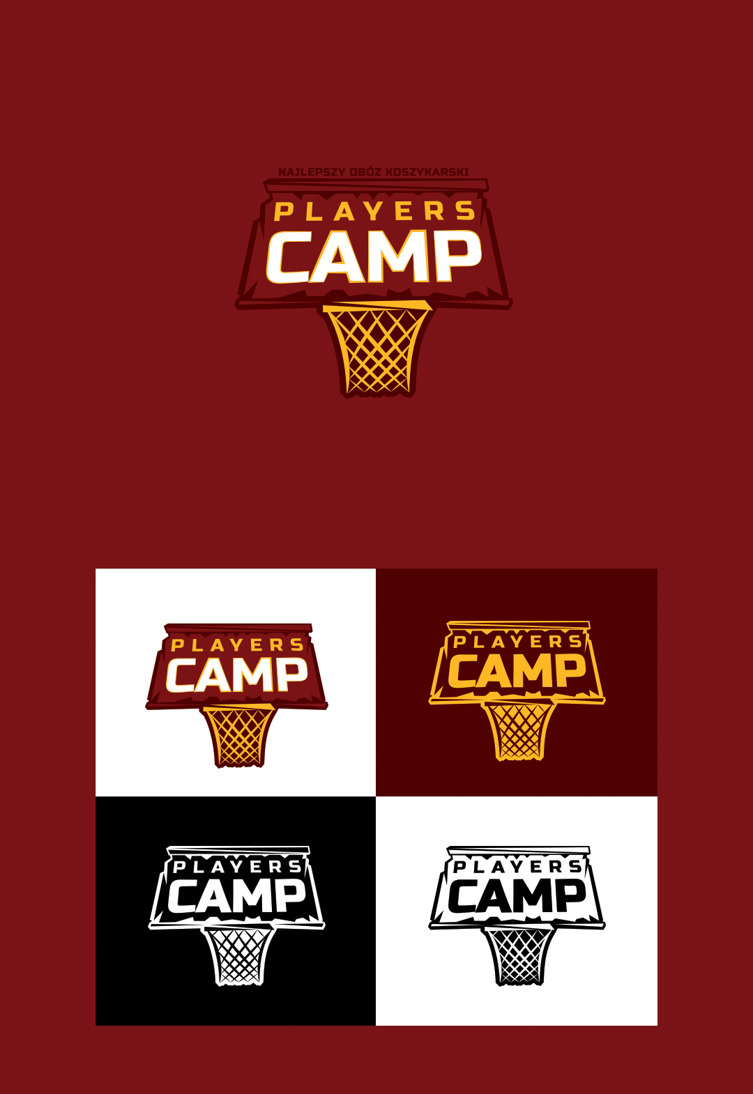
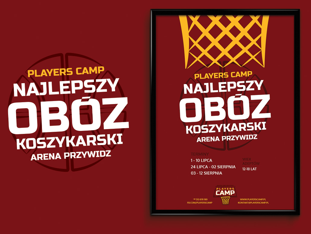
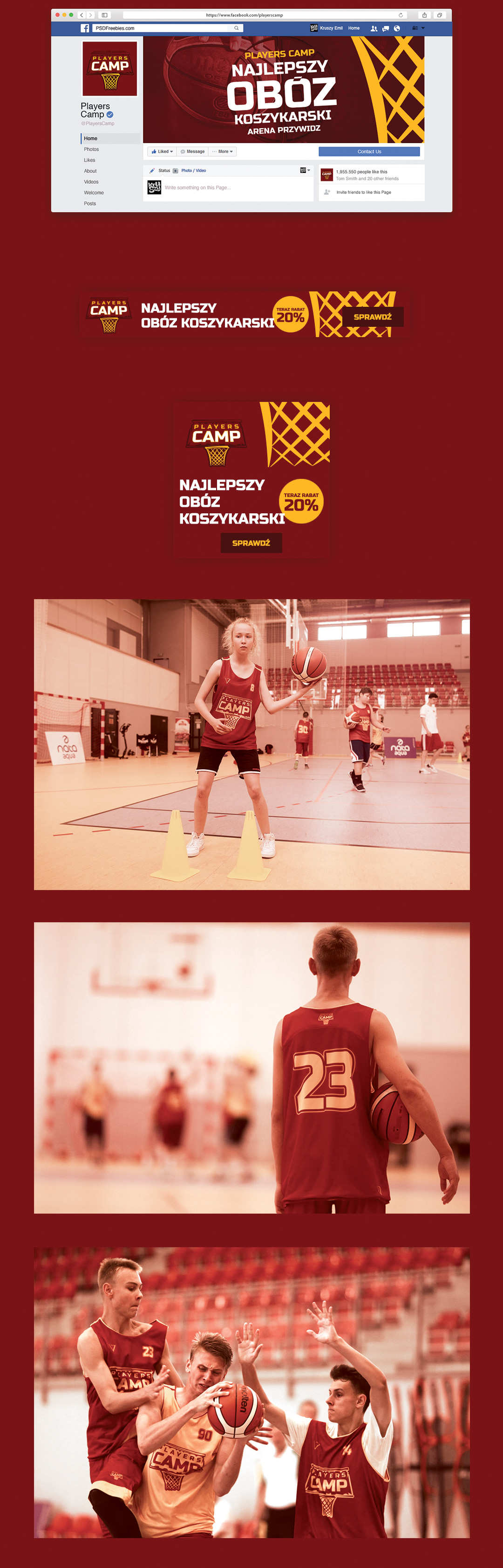
Small branding project for youth basketball summer camp. My task was to design a logo with a client tagline “The best basketball camp”, and some web & prints materials as well. I also created WordPress website, based on a free theme.
Most important in this project was to make this brand look like a sports team, not a boring camp-organizer company. I started with a few sketch-ups and tried to visualized client idea with basketball board and sign on it. Then I proposed first color version, based on light & navy blue (symbolized education and good spirit). After client opinion, I changed a color scheme to the more aggressive, as You can see below.
Date: 02/17
Client: Players Camp
playerscamp.pl
Soft used: AI, PS
FOT. ARTUR PODLEWSKI / 058sport.pl